Accessiway
From compliance vendor to human-centric accessibility leader.
&w=3840&q=75)
The Challenge
Accessiway had earned its place at the enterprise table. The work was rigorous, the team expert, the team.blue backing a signal of real ambition. However, its brand had not kept pace with its momentum, and it showed up as a regional startup with a Webflow site, drowning in category sameness, losing enterprise deals before a conversation could even start.Our Solution
A full brand and digital transformation, built around a single human insight: Accessiway employs people with disabilities as their foremost experts, not as a values statement. That distinction reshaped everything — purpose, identity, tone, site architecture, and the technical infrastructure that governs how AI tools describe them to prospective buyers.The Outcomes
In its first month, the new site saw a 45% increase in organic traffic and a 600% jump in booked demos. The work was picked up and featured by several leading design publications, and a brand that its employees are proud to share with the world.- Brand Strategy
- Positioning
- Tone of Voice
- Messaging
- Visual & Motion Identity
- WIX Studio Website
- Content Strategy
- AI Brand Delta Analysis
Accessiway is a service-as-a-product digital accessibility platform: a combination of SaaS technology and expert-led human services that helps organisations build digital experiences compliant with accessibility standards across Europe.
Where most players in the space offer a widget or an audit, Accessiway offers continuous partnership, with a team that includes people with disabilities as practising specialists at its core.
By the time they came to Your Majesty, Accessiway were already an established force in their field. They had the clients, the expertise, and the credibility that comes from years of serious work.
What they lacked was a brand that communicated any of it.
Their visual identity read as a young regional startup. Their website functioned as an internal service catalogue rather than a tool for winning enterprise business. And in a category where every competitor looks and sounds identical, they had no clear way to stand apart.
They came to us with a clear brief and a bigger ambition behind it. The immediate ask was a rebrand and a new website. The desired future state was something more significant: to be recognised as the definitive European authority in digital accessibility, a premium platform trusted by enterprise buyers not because it helps them avoid legal risk, but because it genuinely helps them build better digital experiences for everyone. A brand, in other words, that reflected the actual depth and human conviction of the work they had been doing all along.
&w=3840&q=75)
“I usually don’t like working with agencies, but Your Majesty changed my mind. It’s been a great process: they took the time to deeply understand our brand, and every deliverable has substance in both content and visual language.
As someone obsessed with meaningful, story-driven content, I’m very, very, happy with the results.”
&w=3840&q=75)
Diana Rabba
VP of Marketing, Accessiway
&w=3840&q=75)
A Category in Need of a Challenger
Digital accessibility looks the same everywhere you look. Blue and violet palettes. Technical language. Messaging built around legal risk and the fear of getting it wrong. Every brand in the space has converged on the same shorthand, producing a category where buyers struggle to tell one vendor from another.
Accessiway’s buyers, predominantly Millennial and Gen Z procurement leads, arrived afraid not of accessibility but of choosing the wrong partner. The category had given them no real way to differentiate.
Accessiway’s Webflow site compounded the problem: it read as a startup, functioned as a service catalogue, and communicated none of the maturity of what the company had actually built.
The brief crystallised quickly. Stop blending in. Build something worthy of the work.
Work—For All
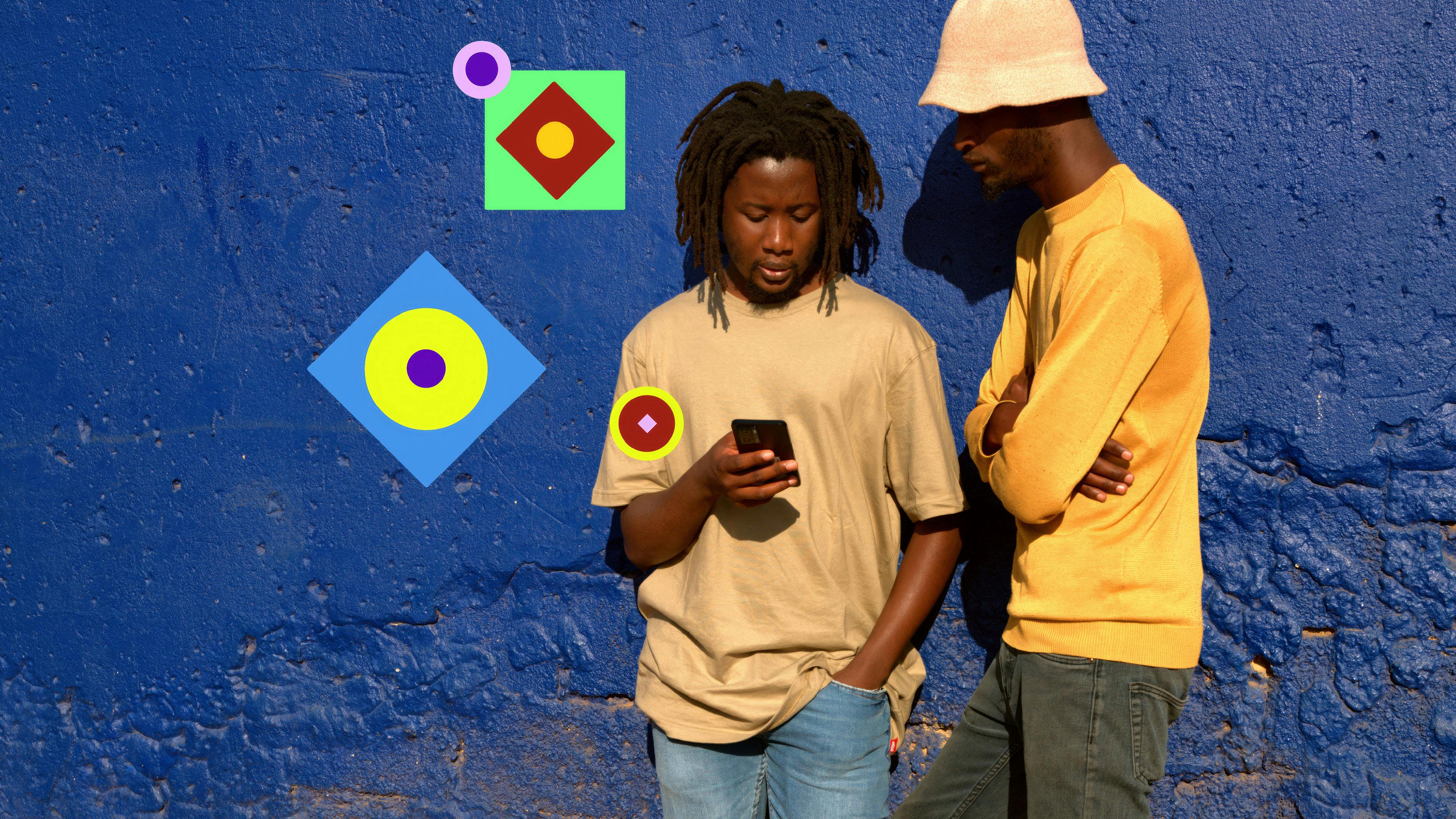
The sharpest insight on this project was also the most human one. Accessiway employs people with disabilities because those people are the foremost experts in the field. That distinction, between performing accessibility and practising it, became the axis everything was built around.
We defined their brand purpose as "Building a better digital world for all" and treated it as a strategic instrument. Their positioning shifted from audit outcomes toward something more durable: a belief that accessibility, done right, changes the experience of being in the world. Confident, partner-oriented language replaced the hedging compliance-speak the category defaults to, treating buyers as peers with a shared goal.
&w=3840&q=75)
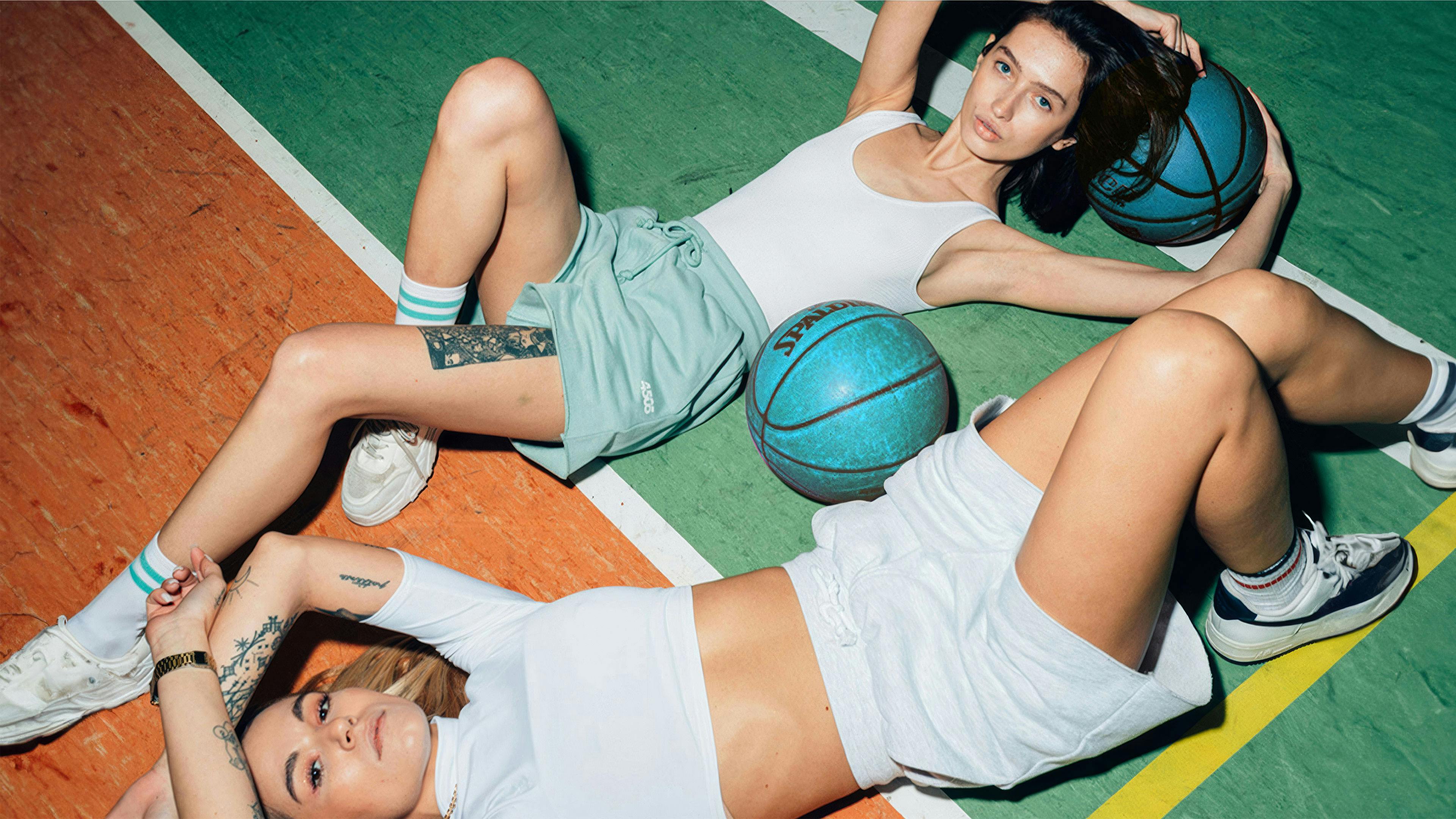
To break the category’s visual monotony, we built a design system with the intentionality of a premium lifestyle brand. Warm, rounded serif letterforms paired with the clean utility of Archivo hold humanity and technical precision in deliberate tension.
The system, named "One System, Many Realities," uses modular geometric shapes that expand and adapt: a visual language mirroring how accessibility itself functions. Documentary-style photography of real people, shot wide and warm, replaced sterile stock illustration entirely.
&w=3840&q=75)
The site was rebuilt on Wix Studio CMS, freeing the marketing team from publishing bottlenecks and giving them full visual control as they scale across European markets. The architecture moved from a fragmented service catalogue to a Persona/Solutions model, guiding Marketing Managers, Compliance Officers, and Tech Leads through tailored journeys that answer their specific questions: ROI, legal guarantees, API integration.
&w=3840&q=75)
“Your Majesty’s biggest value for us is clarity. We always know where we are, what’s been delivered, and what’s next. Compared to other agencies I’ve worked with, their structured communication and visible progress are miles ahead.”
&w=3840&q=75)
Rebecca Pakin
Head of Product Marketing, Accessiway
Brand Delta Analysis
We also ran our proprietary Brand Delta Analysis, auditing how large language models perceive and describe Accessiway across the AI tools their buyers increasingly use for vendor discovery. The findings directly shaped the site’s technical architecture and improved its Presence, Perception, and Performance across LLMs by 65%.
Learn more about our Brand Delta Analysis.
%3Ablur(5)&w=3840&q=75)
%3Ablur(5)&w=3840&q=75)