All Things — Every link, sorted by what it’s about.
Design & UX
Type, interfaces, tools and the craft of making things people use.
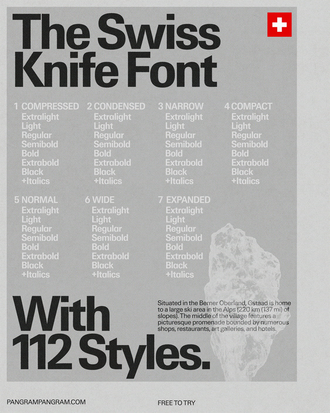
A Font Cut Like a Mountain
Pangram Pangram cuts a typeface like an alpine ridge, proving a font can carry the crisp air of a place.
itsnicethat.comTypographyThe Way — Meditation That Lasts a Lifetime
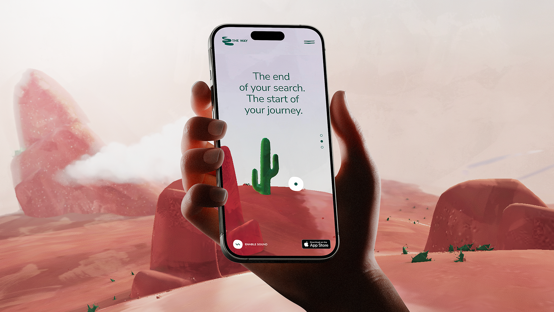
Full disclosure: we built this one. Fresh redesign for The Way, done to make someone's first five minutes of meditation feel like an invitation.
An Entire Archive Devoted to Italian Water Bottle Labels
Decades of mineral-water label design, scanned and catalogued — the kind of niche archive that makes the internet worth loving.
acqua2o.itTypographyWhy Designers Quietly Avoid Making Things Too Accessible
Joost's pick — an honest look at the discomfort behind accessible design, and why teams treat it as a checkbox instead of a craft.
Order & Chaos, One Layout a Day
AIZIZA spent three months publishing one stripped-down, experimental web layout a day, testing how far minimalism bends.
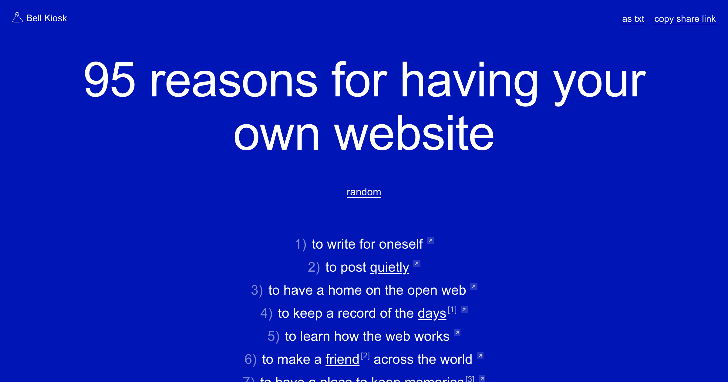
ordernchaos.aiziza.comWeb design95 Reasons for Your Own Website
Elliott Cost is keeping a running list — 95 and counting — for why a personal site still earns its keep in 2026.
Box Squad
A generative type toy that spits out weird, boxy letterforms every time you refresh the page.
Koto Launches CCType Foundry
Koto launches CCType — a foundry whose debut serif draws on early British metal type and cool Swiss modernist geometry.
Accessibility as a business case, not a compliance checkbox
Learn why building accessible digital products isn’t just the right thing to do — it’s also the right thing for your business.
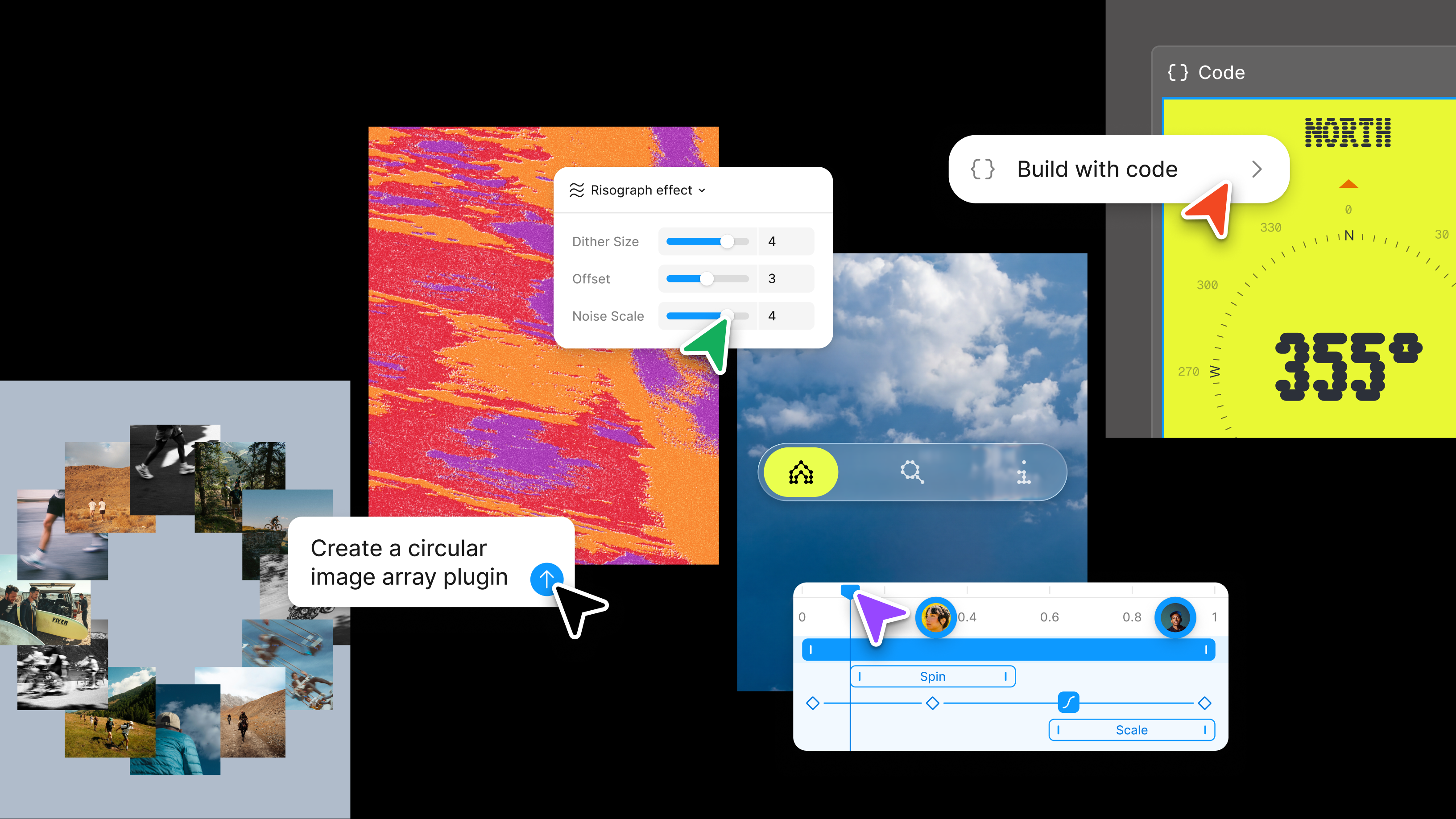
Figma Config 2026: New Materials, New Tools, and a More Expressive Canvas
Code layers, native animation, and AI skills — Figma blurs the line between design file and production-ready codebase.
AI in Design Report 2026
AI in Design Report 2026: 900+ designers, 65% use Claude Code, roles blurring.
Ferrari launches its first electric car by Jony Ive
Unless you've been under a rock, you've seen stark reactions of love—but let's be honest, mostly hate—for the new direction of the automaker.
dezeen.comNewsDesign Week Guide: May 2026
NYCxDesign, London Craft Week, Clerkenwell, Frieze NY, DesignMarch, Melbourne Design Week, Global Design Forum Istanbul — all in May.
dezeen.comExhibitionsA Better Way to Live With Your Fonts
Pica is a MacOS font management app that makes your type library actually usable. Small tool, big quality of life upgrade for anyone who works with type seriously.
When Usability and Accessibility Diverge
As vibe coding accelerates interface creation, a growing gap is opening up between what works and what works for everyone. A clear-eyed look at what AI-generated UX is quietly leaving behind.
Teaching Tech vs. Cultivating Taste
A provocative look at why graphic design schools are functioning more like trade schools and less like the incubators of cultural instinct they should be.
itsnicethat.comEssayThe Art of the Early Prototype
This Miro event replay explores the critical gap between research and design, where visualizing ideas early can change a product’s entire trajectory.
Is This the End of CSS?
A provocative look at why the future of text layout might move beyond the traditional constraints of the web’s styling language.
Sensory-Rich Design in 2026
As we drift deeper into digital worlds, designers are using hyper-realistic textures and light to bring a sense of touch back to the screen.
John Maeda’s Design in Tech Report
The definitive look at how computational design and new patterns in business are revolutionizing the creative ecosystem.
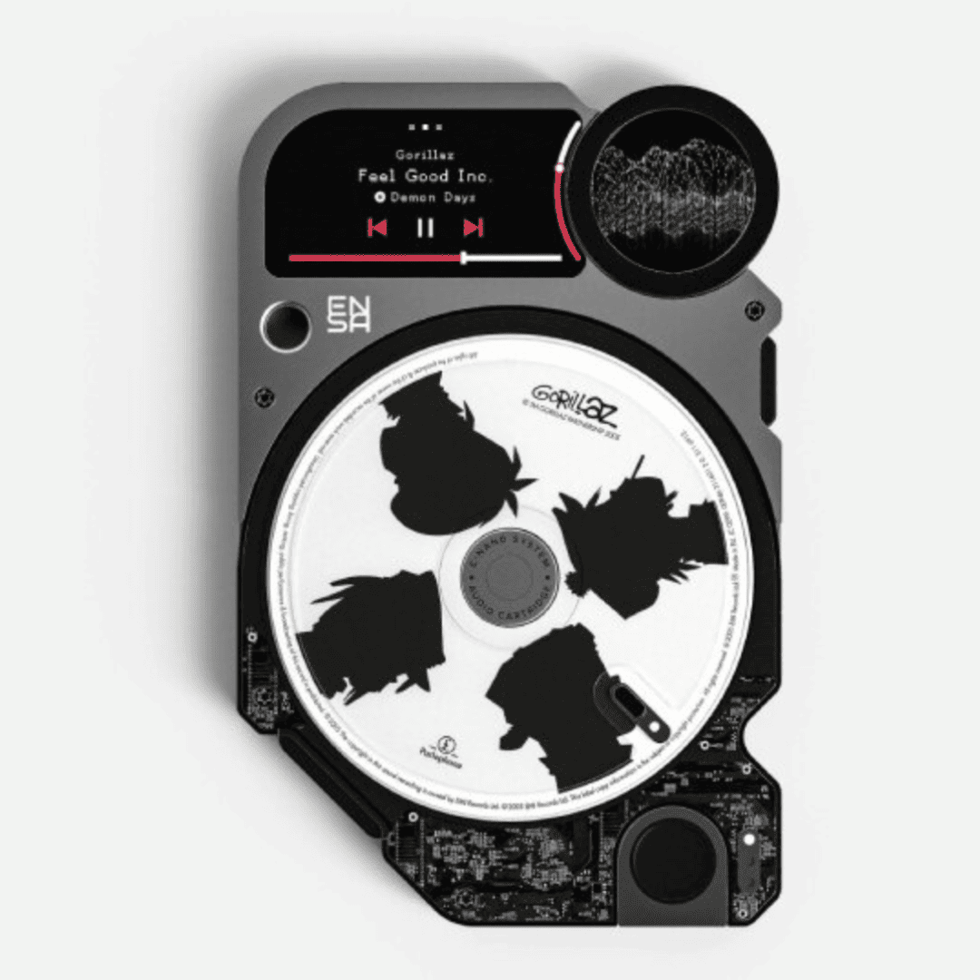
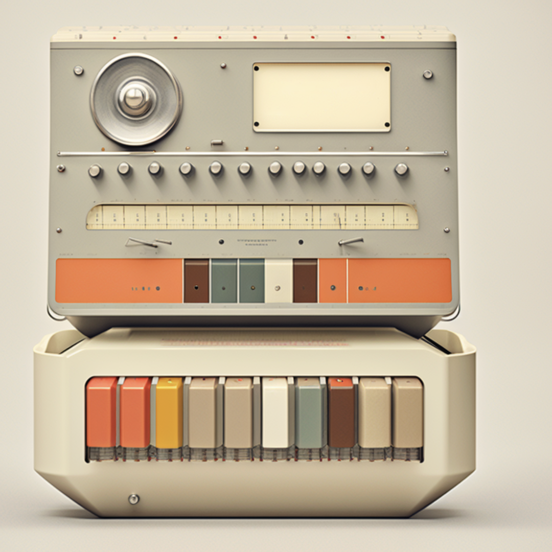
Music You Can Hold
The ENSA P1 concept restores the tactile ritual of listening by using physical, disc-shaped cartridges for digital high-fidelity audio.
designboom.comMusicFigma’s State of the Designer 2026
While AI handles the speed, this global report confirms that long-term success still hinges on human craftsmanship and creative autonomy.
Why Packaging Is Design’s New Power Player
No longer just functional, the box is now an emotional touchpoint and one of the most culturally revealing spaces in contemporary craft.
creativeboom.comTrendsNew Year, New Glyphs
The type world is already setting the tone for 2026 with a fresh crop of expressive, high-contrast faces.
Press Start
How decades of video game navigation are quietly schooling the next generation of spatial interfaces and AR/VR design.
Adobe’s crystal ball for 2026
Authenticity, experimentation and human nuance headline Adobe’s latest trends report. Less polish, more point of view.
From <br> to Beyond
A thoughtful look at 30 years of web development, tracing the shift from simple markup to sprawling systems.
The Portfolio of Anatolii Babii
Beautiful, considered work from an independent designer in Kyiv. It’s a reminder that great craft doesn’t need permission or a platform to speak clearly.
antlii.workWeb designThe SoDA Report on a New Era for Creativity
A deep dive into the trends defining digital creativity’s next chapter, where craft meets computation and designers become cultural translators.
Custom-Made Browser Tools to Play With
A delightful set of free, handcrafted tools that turn your browser into a playground for curiosity, typography, and tiny creative experiments.
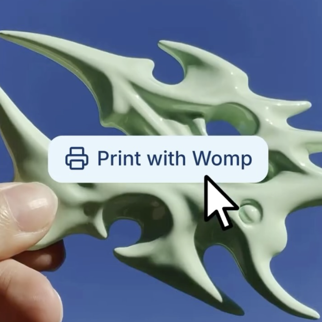
Make Your Ideas Real
Womp turns imagination into physical form with beginner-friendly 3D modeling. No experience required, just curiosity!
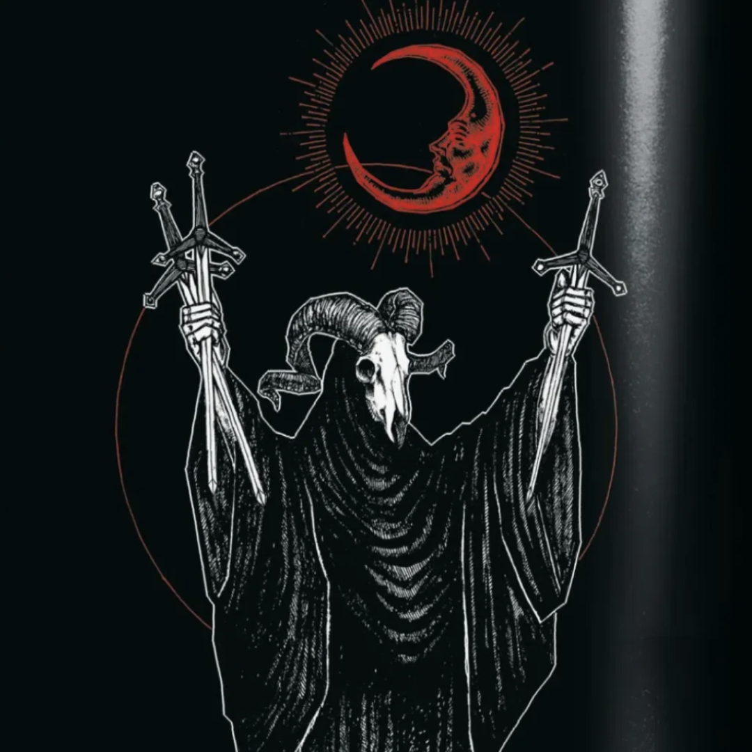
The Gothic Isn’t Dead - It’s Just Rebranded
A great piece that looks at the resurrection of gothic imagery in contemporary design. This is gothic as aesthetic language, not costume.
A Typeface Engineered to Be Timeless
Jonathan Hoefler’s MK Hera is a masterclass in controlled evolution: flexible enough to shift across time and formats, but sharp enough to leave a mark.
jonathanhoefler.comTypographyDesign Spotlight: A Lantern for Yachts
Sir Jony Ive and Gen Terao teamed up to design a sailboat lantern that blends analog romanticism with obsessive detail - and we love it.
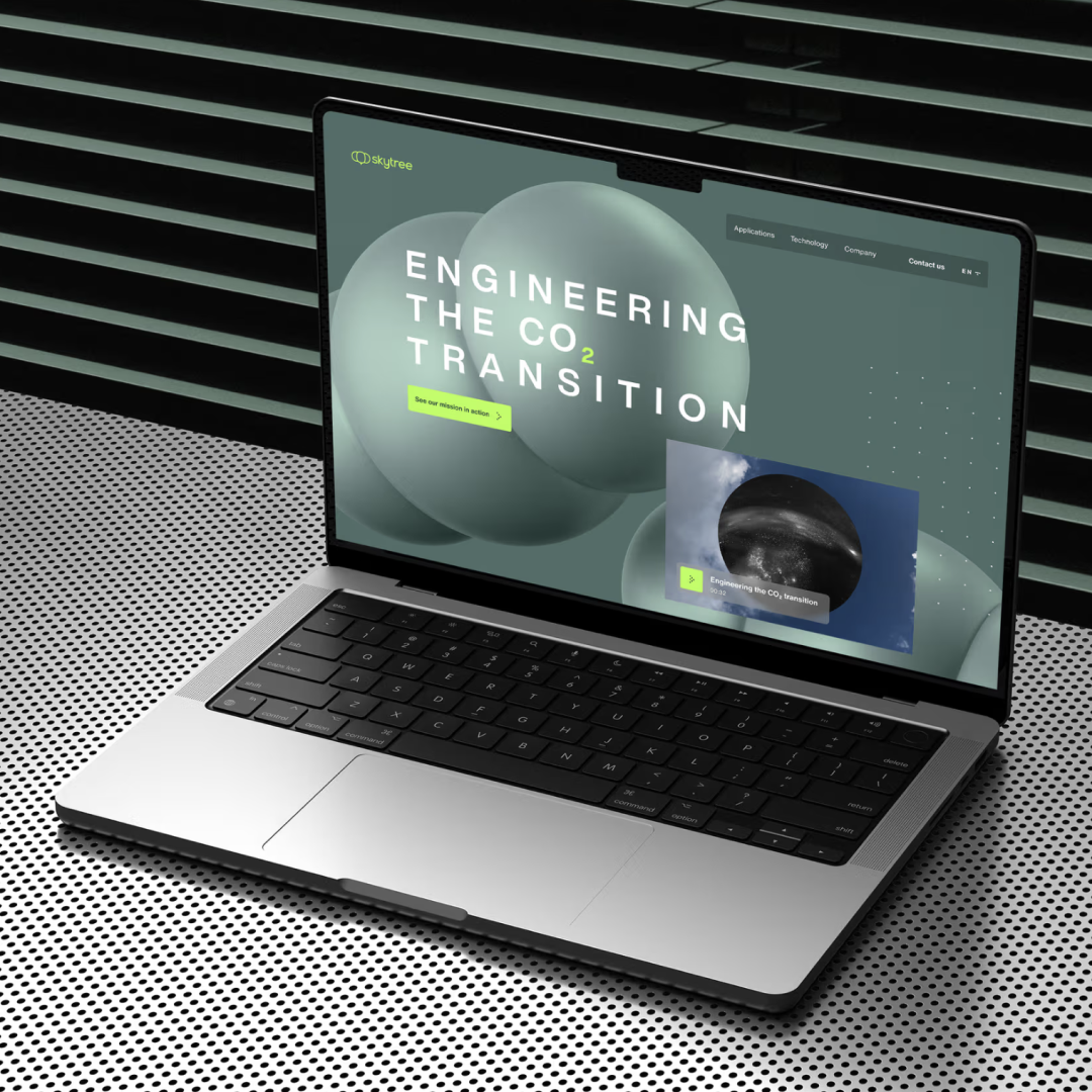
boatinternational.comNewsSkytree’s Digital Transformation
Our redesign of Skytree’s website is more than a visual update — it’s a new way of informing, educating, and converting with clarity and impact.
How to Design for a Future That Keeps Morphing
In this wide-ranging conversation, designer Nick Foster explores how to design for a future that never stays fixed.
UX Is Dead, Long Live AX
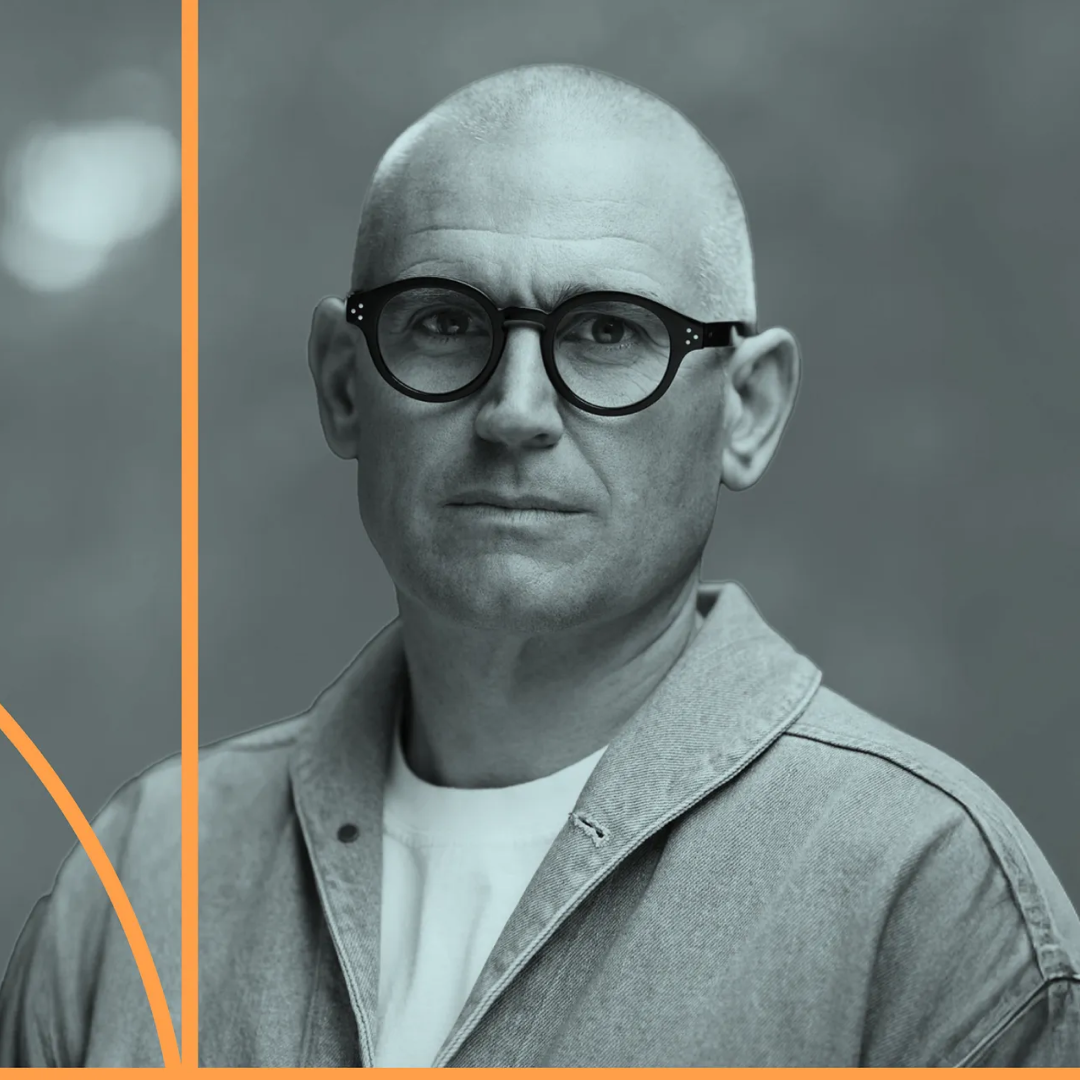
John Maeda maps the shift from user experience to agent experience, where AI tools act on behalf of the user.
The Visual Culture of Women’s Sport
Following the success of the Lionesses at the Women’s Euros, the creative industry is finally treating women’s sport as a rich & complex culture worth showing up for.
What Happens to UX When AI Becomes the User?
In the latest episode of our podcast Delivered, Georgios spoke to Decathlon’s Constantine Gavrykov to unpack what AI agents mean for the future of product design.
Poster Power for the 2026 Winter Olympics
The official art posters for Milano-Cortina 2026 just dropped and they’re stunning. Playful, gritty, poetic and definitely worth hanging on your wall.
Hello AI, Goodbye UX (as We Know It)
Constantine Gavrykov, Senior Director of Product Design at Decathlon, spoke to us about how to successfully navigate the radical shift in UX design.
Championing the CO₂ Transition with Skytree
We partnered with Skytree to design and launch a bold new digital home — one that captures their mission to harvest CO₂ from air and fuel a circular future.
Config 2025: Crafting quality that endures
When we build tools, we shape environments that will in turn shape us—and at Linear, Karri Saarinen has championed quality as the foundation, not an afterthought. In this talk, he'll share lessons from Linear's journey.
Echoes from the Lost Internet
What we can still learn from a Flash Website built in 2000.
2025 Design in Tech Report (Unedited): Autodesigners on Autopilot
The top takeaways from John Maeda.
Elizabeth Goodspeed on what happens when we treat the past like a stock library
Not all borrowing is the same. From public domain illustrations on book covers to AI’s data hoarding, who really owns culture – and who gets away with taking it?
The state of UX 2025
UX Collective share their predications for what to expect for User Experience (UX) Design in the next year.
Elizabeth Goodspeed on untangling credit in design
As Athletic Greens’ meteoric rise shows, a brand’s success often depends on its identity system. But who gets recognition for the work when multiple studios shape a brand over time?
The Biggest Font Trends To Look Out For In 2025
From a sans-serif backlash to neo-retro revivals, our experts predict a diverse typographic landscape for the coming year.
Key trends in audiovisual design: what's next for 2025?
In the fifth of a special six-part series, the latest instalment from Creative Boom's trend report look at the cutting-edge developments shaping the future of audiovisual design and how they're set to transform brand experiences by 2025.
Adobe reveals a content authenticity app to 'champion creator protection and attribution'
Research has found that 91 per cent of creative professionals seek a reliable way to attach attribution to their art and design. Adobe's soon-to-launch Content Authenticity is a tool that may just offer that solution.
How not to use box shadows
So you think you know box shadows huh? I bet you didn't know they could do this.
dgerrells.comWeb designHow to use music to transform your visual content
A special six-part series focused on the use of music in modern design. In part one, a look at the importance of music to visual content.
creativeboom.comMusicDigital meets Physical: Risograph Printing with WebGL
Your Majesty’s Creative Developer Max combines artistic flare with digital skills in this experimental creative process.
Figma’s new Slides app focuses on design, fun, and (oh, yeah!) AI
With users creating over 3.5million slide files in the last 12 months, Figma has answered the demand with a dedicated slide app.
Can you taste design?
Is the gentrification and commercialisation of cities, not only ruining high streets but also the very way we taste and enjoy food?
Creative Technology Ecosystems
These insights and origins of the tools creative technology industries rely on can help fuel new creative capabilities and methods of expression.
ablairneal.comDesign toolsProto-typography: how type is dictated by the surface it’s written on
A typography subject lacking in interrogation. Explore how the medium has always shaped the message.
itsnicethat.comTypographyWhy it seems like the sky is falling for digital design, and how to come out of the storm stronger
Post-pandemic tech boom, many companies worldwide are re-evaluating design’s role in business – designers must evolve and adapt to the market.
Elizabeth Goodspeed on the importance of taste – and how to acquire it
With so much ‘sameness’ being spouted out of AI image generators, what it means to have ‘taste’ is becoming more and more important. This author explores.
itsnicethat.comGenerative AIFable Prism
“Where designers control generative AI” – this platform enables designers to add layers of gen-AI over their motion graphics to enhance, change and modify.
The age of average
In an age where literally everything looks the same, is it time to introduce some originality into design, culture and life?
The State of UX in 2024
From AI to market saturation, this report critically examines the industry to help designers navigate the upcoming challenges and influences.
Velvetyne Fonts
Looking for new font inspiration, check out this open-source font association and collective. The team are dedicated to researching and disseminating typography and typeface creation.
Remote working seems to be making product designers more job-satisfied
Unexpected findings about the experience of digital product designers in a post-pandemic world are shared in Figma’s new State of the Designer report.
Motion Design Principles
Learn more about the power of Motion, through an experience that does exactly that – showcases the power of UI/UX animation in conveying the mood and character of a brand.
Making Motion Meaningful
Keen to learn even more about motion? Google's classic four principles of motion help designers and developers implement effective motion design.
design.googleUXWhy NASA Chose WordPress for Revamping Its Flagship Website
After 18 months of web development, data migration, and content building, NASA has emerged with modernized flagship and science websites – all built on WordPress.
Access Questions for Self-Publishing
A print pamphlet and online resource created to enable students to begin thinking about what accessibility means within self- and independent publishing.
aqfsp.camberwellgraphicdesign.comBooksAdobeMAX Sneaking the Sneaks: #ProjectStardust
Remove distractions, switch elements and change outfits - this ‘object aware’ tech and more AI integrations will be unveiled at next week’s Adobe MAX conference.
The fascinating evolution of typing Chinese characters
This history lesson offers a brilliant example of how innovations can bridge the gap between the digital world and the real world.
Imagine a website. Now generate it.
Interesting concept - this site builder promises you the ability to build a sitemap and wireframe in minutes with the help of AI and then easily export to Figma and Webflow.
Visual Design Hacks for the Non-designer
Want to level up your work and make it look more visually appealing? These three design tips are perfect for non-designers who just need some simple tricks.
nngroup.comUXThe Test of Time: How are designers creating long-lasting, impactful work?
With the need to constantly churn out ‘content’, creating work with visual impact often gets overlooked.
itsnicethat.comTrendsThe age of average
In an age where literally everything looks the same, is it time to introduce some originality into design, culture and life?
Spotify’s new design is part TikTok, part Instagram, and part YouTube
Pushing more than just music is at the heart of Spotify’s ongoing strategy to help audio creators get discovered through new design features.
Design thinking was supposed to fix the world. Where did it go wrong?
A call for greater emphasis on ethical considerations and social responsibility when it comes to design thinking.
Type funky
Get creative with this interactive and dynamic online typeface builder, as exemplified in our funky 10 Things header image above and to the right.
Forward Thinking: What can the creative world expect in 2023?
Uncover the topics, trends, worries and wonders that will shape the design industry in the year to come.